Wildstahl
Website & brochure
About Wildstahl
Wildstahl is an Austrian metal artist creating one-off sculptural pieces and bespoke commissioned artworks.
The existing website had become outdated, difficult to navigate and hard for the artist to maintain. The aim was to simplify the brand, put the artwork back at the centre and create a website that was easy for both clients and the artist to use.
Challenge
The existing website had become cluttered and difficult to navigate, with too much information competing with the artwork.
The positioning was also unclear. Commissioned work, available pieces and general information all had similar importance, making it harder for potential clients to understand what Wildstahl offered or what to do next.
The artist also needed a website that could be easily updated as new work became available, pieces sold and new commissions were completed.
Solution
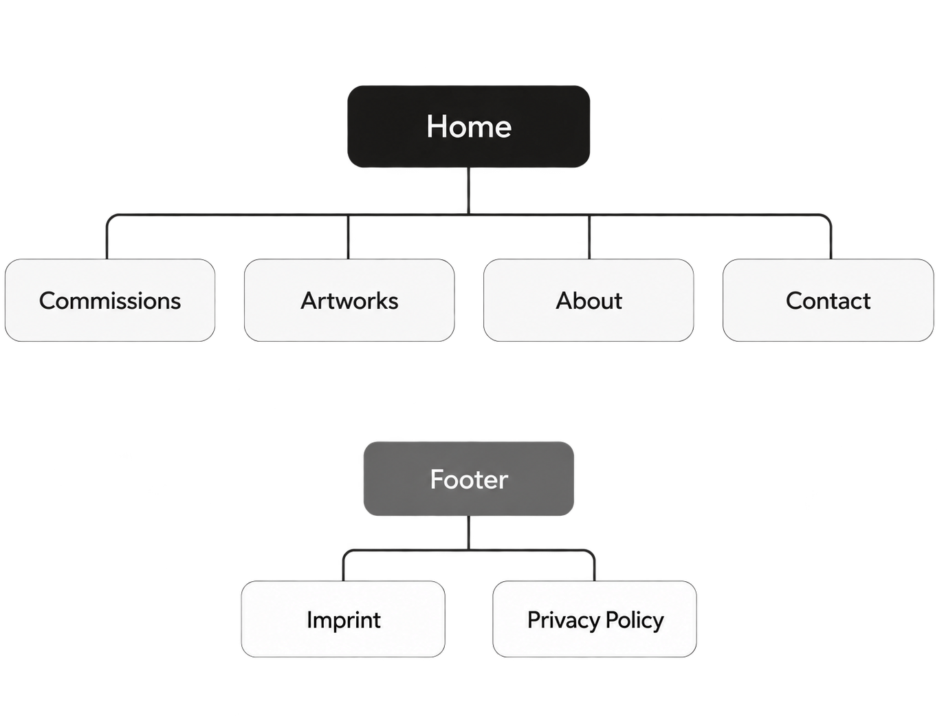
Strip the website back to what actually mattered: the artist, commissioned work and available artwork.
The new website was built around two clear customer journeys:
Commission an artwork
Understand the process, explore previous commissions and make an enquiry.
Buy available artwork
Browse pieces currently available and purchase directly online.
Brand Refresh
Refining, not reinventing.
The existing identity already had a strong industrial character, so the aim was not to completely reinvent the brand.
I refined the logo, typography and colour palette to create a cleaner, more contemporary visual system that worked better alongside the artwork and could be used consistently across the website and brochure.
Logo
Typography
Headings
Inter
AaBbCc123
Paragraphs
Inter Light
AaBbCc123
Colours
UX & Website Design
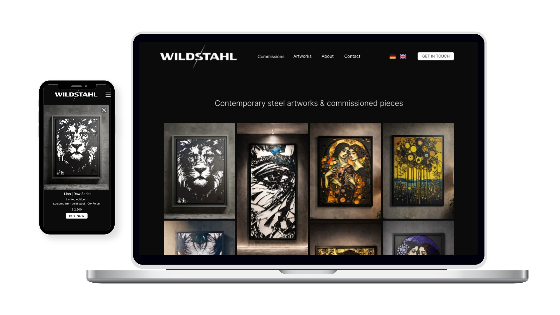
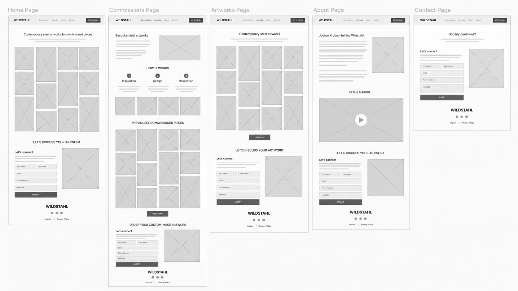
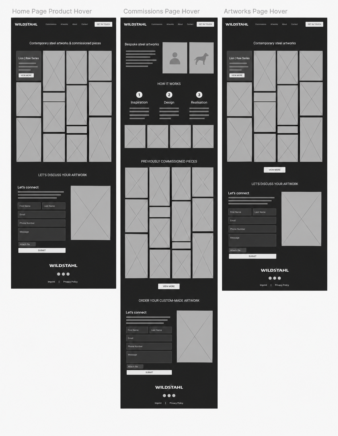
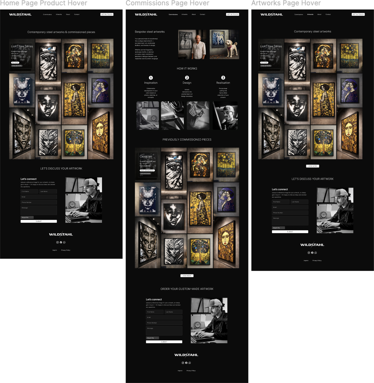
I simplified the website structure and designed the experience around how a potential buyer or commissioner would actually use it.
Clear navigation
Fewer routes and a simpler hierarchy made the website easier to move through.
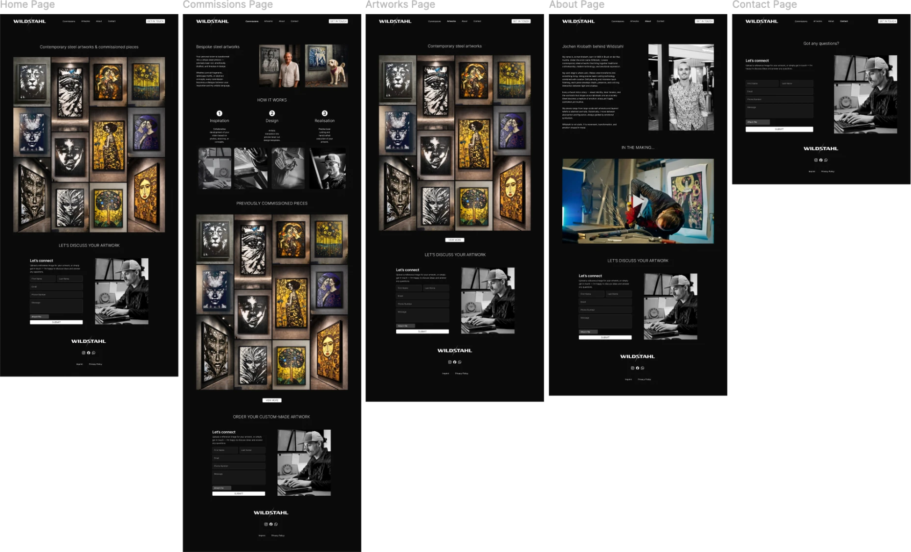
Artwork first
Large imagery and minimal copy kept the focus on the work itself.
Clear actions
Visitors could quickly purchase available artwork or enquire about a bespoke commission.
Desktop & Mobile
The mobile experience was designed alongside the desktop in Figma.
The navigation, artwork layouts, content hierarchy and calls to action were adapted for smaller screens while keeping the same simple, image-led experience.
Brochure Design
Taking the same direction offline.
I also designed a printed Wildstahl brochure for exhibitions and art events.
The brochure followed the same visual direction as the website, introducing the artist and his work in a simple format that could support conversations with potential buyers and clients interested in commissioned pieces.
Outcome
Wildstahl launched with a completely redesigned bilingual website that puts the artwork at the centre of the experience and gives visitors two clear routes: purchase an available piece or enquire about a commission.
To make buying individual artworks simple, an easy checkout using Stripe was set up, so clients can pay securely in just a few steps.
The final website is easier to navigate, easier for the artist to maintain and gives Wildstahl a stronger, more consistent presentation across desktop, mobile and exhibition materials.